
Mind map on products, end up I choose pillow case.

Some thumbnail sketches


After further development, i choose cushion case and do mind map on it

Survey form and my written analysis, analyse how many people like sweet, cute thing, how many people like vintage style, etc.

Reason of why I choose cushion case..Why I use paper iron not silk screen?
I use iron paper because I want to do the vintage effect.

Here's some cushion case thumbnail sketches.

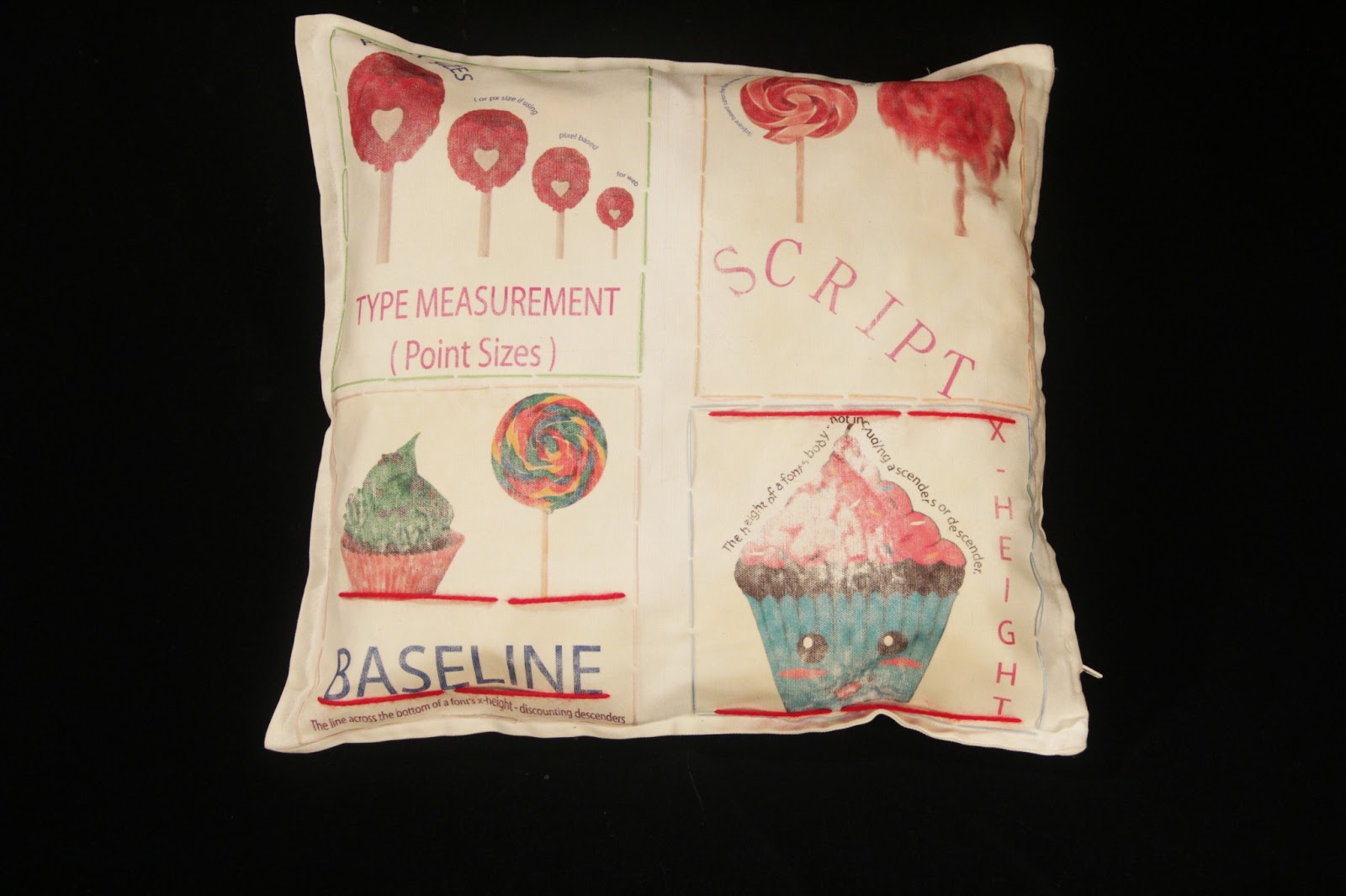
Here is the initial sketches of the cushion case and typographic term. The 8 terms that I've chose are X-height, Descender, Ascender, Baseline, Weight of Type, Type measurement (Point sizes), Script and Kerning.


This is the sketches of the combination of two typographic terms on the cushion case.

The composition of typographic terms


Idea development

Layout Design

Colour exploration on background, and I choose yellow brownish colour to show the vintage style.

Colour exploration on threads.

Rotated it after designed it in the illustrator, so that we can print on the iron paper.

These are the process of printing on the cushion case by using paper iron.

And here's some final sketches on my typo terms.


Here's my cushion case :) I stitched on the ascend part and descend part so that enhance the terms and also stitched the background to enhance the vintage style.
Front view

Front view

No comments:
Post a Comment